Time To Know
Background
Time To Know is a fully cloud-based learning platform.
The company wanted to appeal to new audiences around the world, and strengthen its brand. Create a strong and prominent identity compared to its competitors.

Process
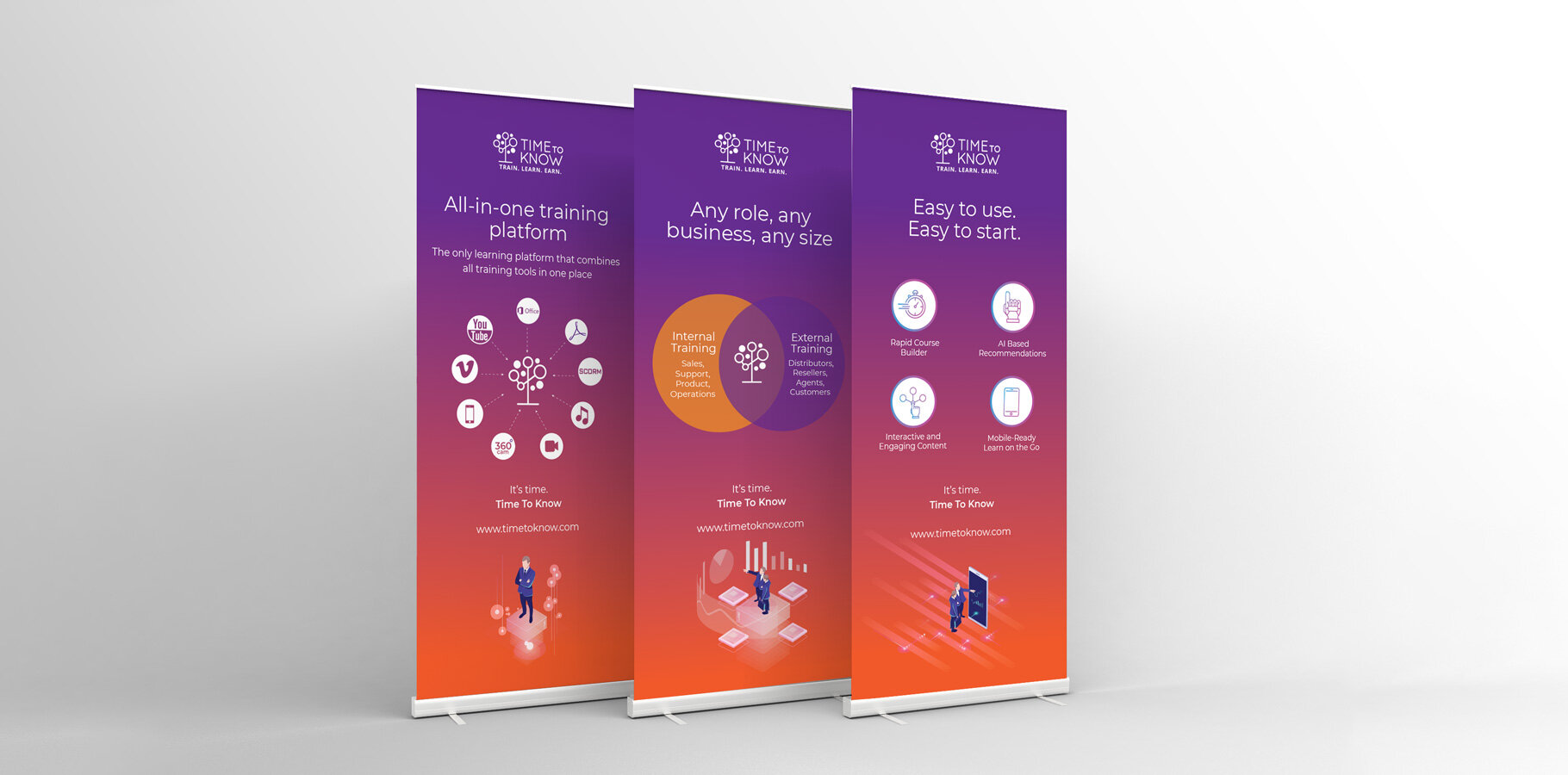
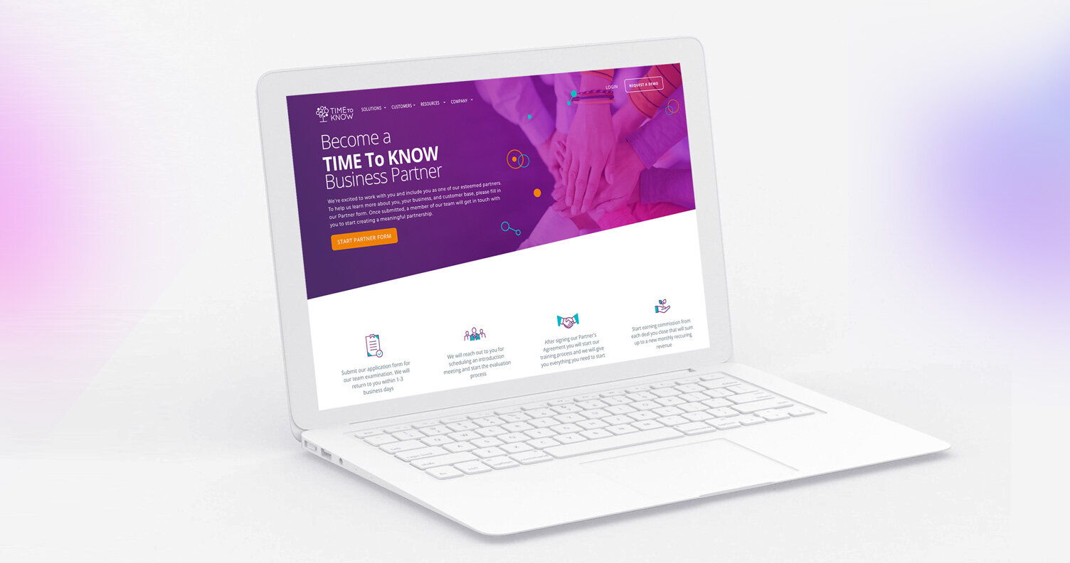
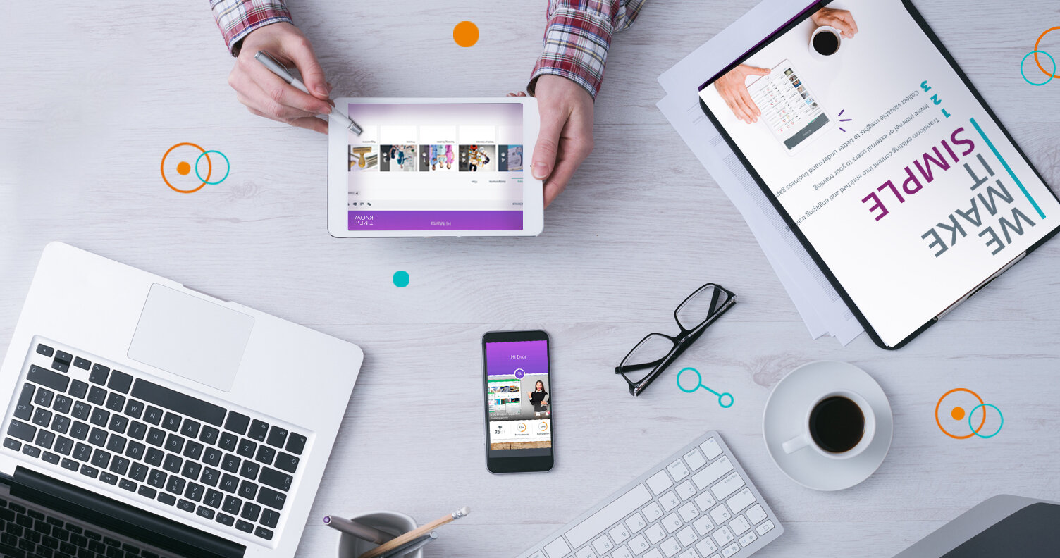
In collaboration with VP marketing, we created a new graphic language for the company. After researching with the competing companies, we came to the conclusion that the use of bright colors can create the uniqueness of the company. We chose to use strong colors of purples and oranges, and use gradients. We have created a uniform language for all platforms and printed products.


Outcome
The change in time to know's look and feel was significant and led to the creation of a new target audience of users on the platform. The company's visibility is fresh and original. We used illustrations as part of a design, and it created a language that conveys innovation and technology.