John Bryce
Background
John Bryce, the training arm of Matrix, is a leading training company in the field of computer training and information technology. The company has decided to create a new graphic language, which will transmit innovation, technology, breakthrough, and uniqueness. As an employee in the company, I was leading the process of re-branding.

Process
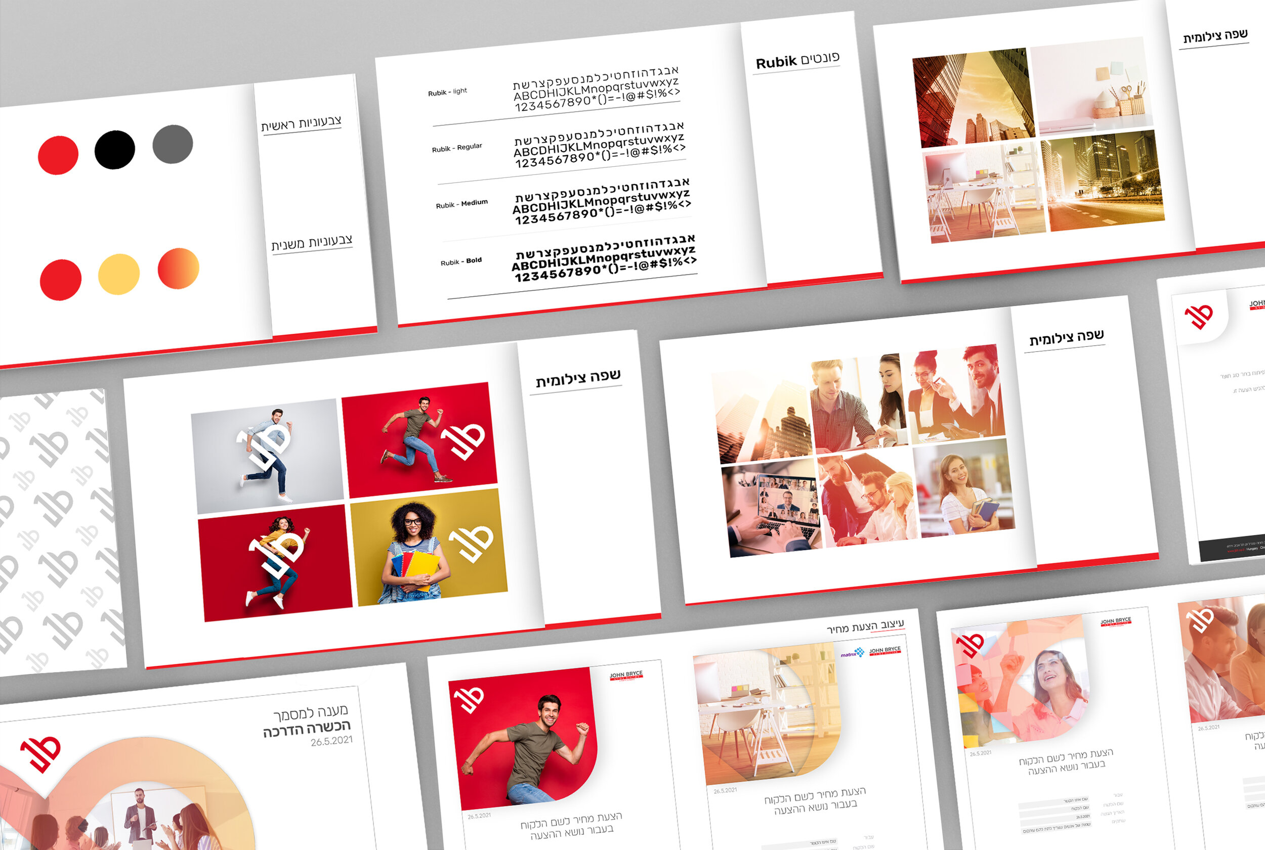
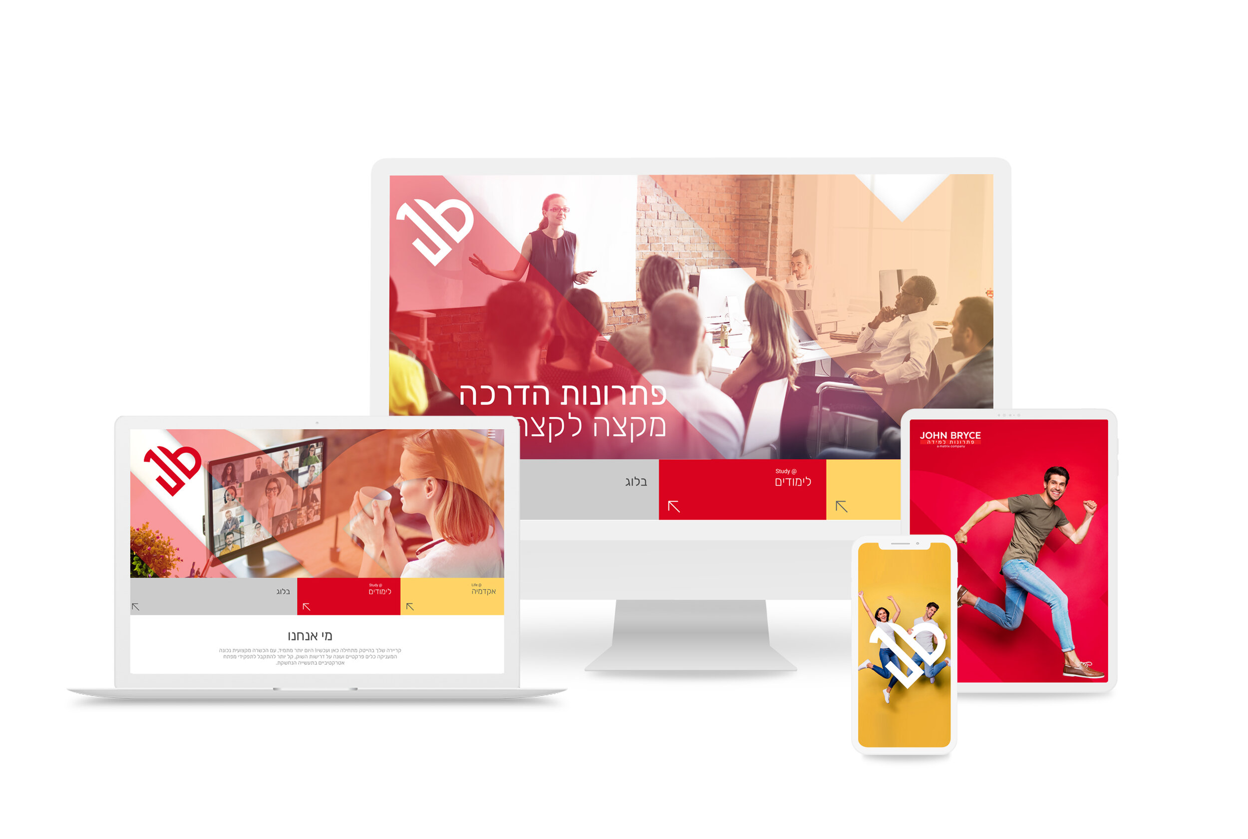
At the beginning of the creative process, we conducted a comprehensive comparison with competitors in the field of courses and learning. We have created a logo that will appear on all of the company's products. The symbol is a heart formed from the two letters - J & B. We used strong colors - the color red which is very significant in the company and we added the color yellow and the transition color between them. We created a distinctive photographic language by using colored background figures that hold the heart.

Outcome
Following the creation of the new graphic language, John Bryce has become a company that conveys technological leadership, innovation, and creativity. The change applies to all of the company's marketing products - social media, the company's website, internal products such as presentations, and price quotes. The branding strengthened the company's visibility and created a significant differentiation of the company from its competitors.