Tondo
Background
Tondo provides industry-leading smart lighting solutions that combine intelligent lighting controllers with a centralized management system
As a leading company in the field of smart cities, Tondo was interested in creating a leading and innovative design language. An original design that will be instantly recognizable.
Process
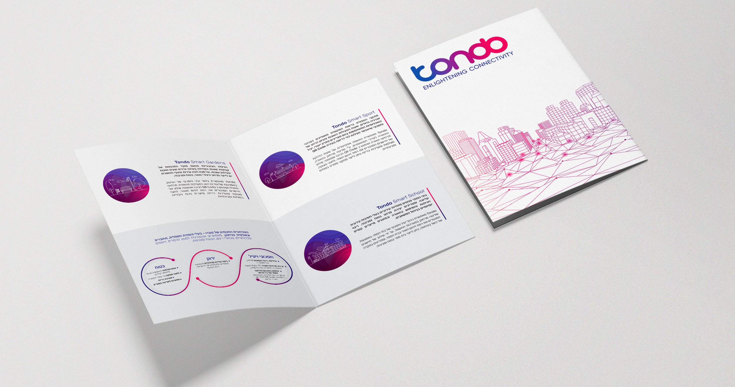
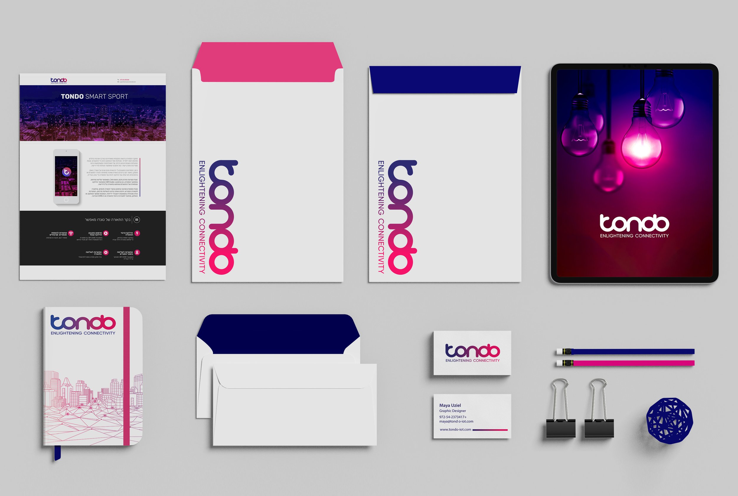
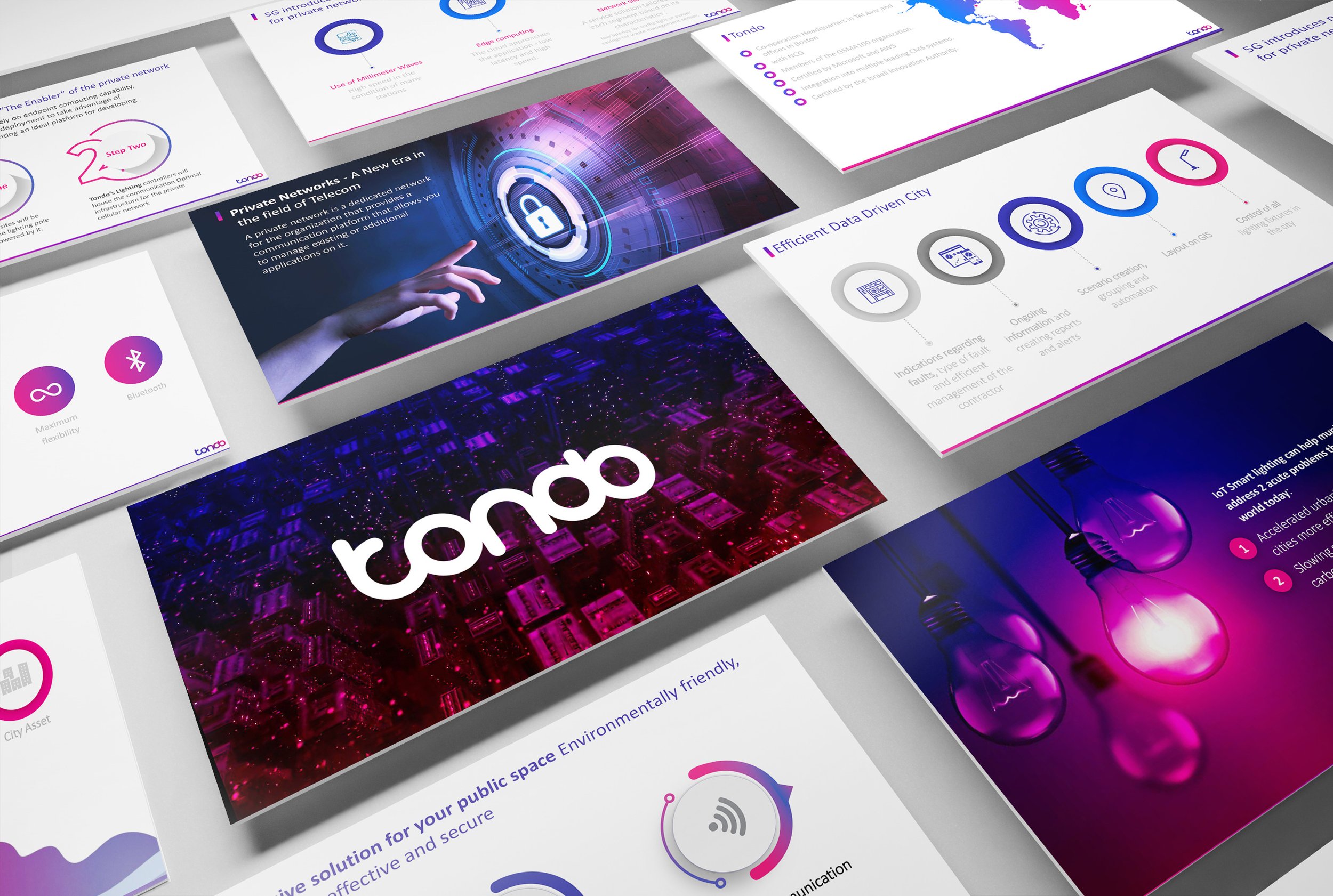
The design of Tondo drew the colors from the colors of the logo - blue and magenta. Use of phosphorescent colors in their combination, and use of gradient colors. Tondo's design combined very strong colorful images in combination with subtle icons and texts. This combination created sophistication and a unique prominence for the company.

Outcome
Tondo's original look and feel created prominence and design boldness. The company was able to raise due to its visibility, and additional investors invested in it and believed in the product.